For the final case study, the task was to design two flows for an email marketing campaign web app, called WhooshMail. The two flows walk through the same screens, but with two different user roles. The first role is "Admin" and has the highest level of access while the second role, “Basic”, only has access to a few features.
The intial planing was to create 2 personas to fit the criteria for the brief. From these personas and further invstigation into competitors site, I created wireframes and then a prototype which was tested on users. Once the testing was over I then went on to create a hi-fidelity version, which I dropped into a presentation for stakeholders to show and explain my work.
WhooshMail wants to improve the experience for both of these roles - Admin & Basic, with their audience of small business owners and entrepreneurs. Small business owners want an easy way to keep in touch with their customers, without the process being clunky and confusing. There's a lot of competitors out there, so Whooshmail wants to stay competitive and incoroporate similar features. What features are accessible to each user role can be confusing, so Whooshmail wants to make sure it's obvious to each user their accessibility. Through improving their experience for our main user roles (admin and basic), WhooshMail wants to see an increase in user retention and also the number of campaigns sent.
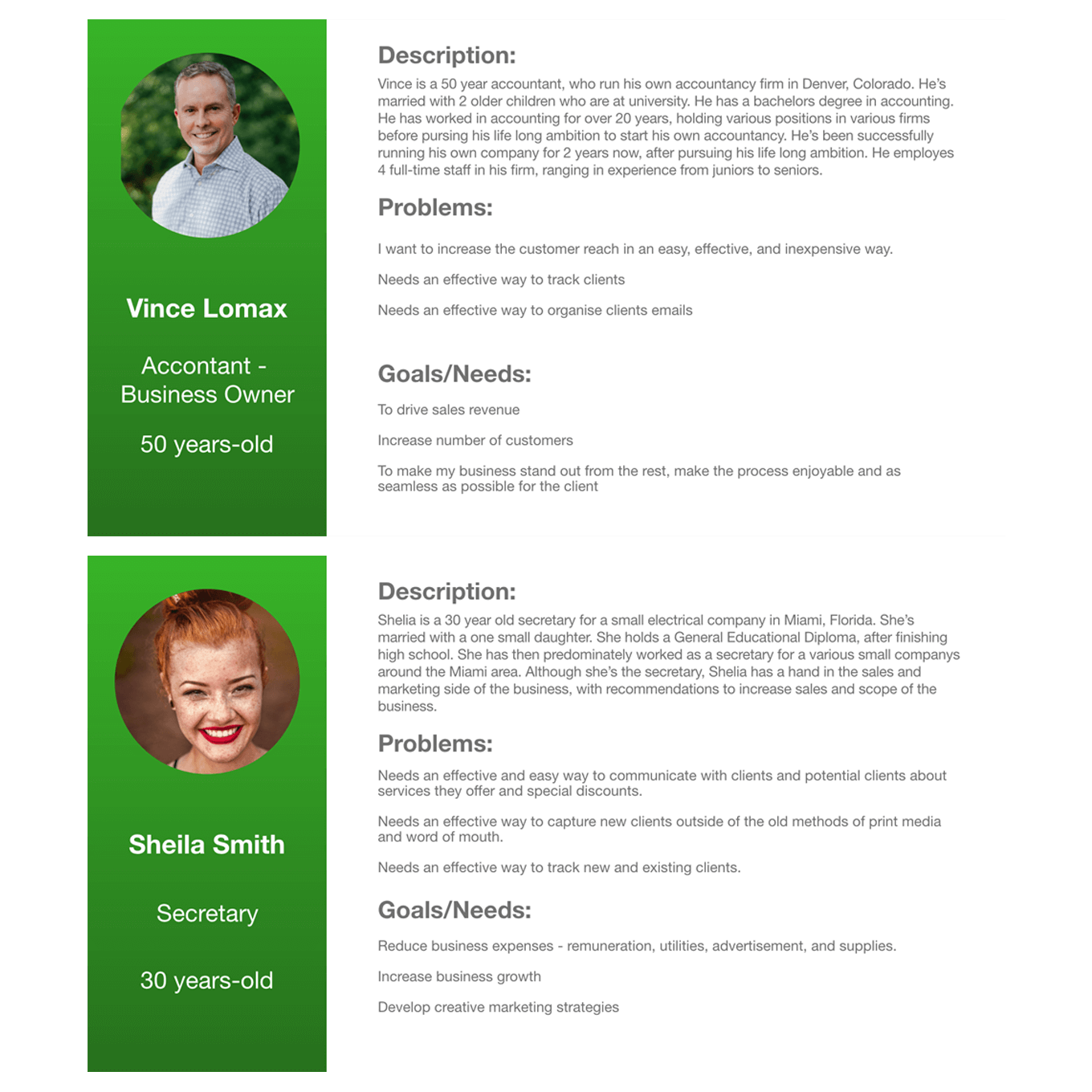
I created 2 personas from the desired target audience below:
Admins:
Basic:
I think users are interested in what level of marketing platform they want for their journey. They are looking for what’s right for their needs and options for all aspects of their campaigns. I feel that offering different levels of plans to users can help them decide on the level of scope required for their campaigns.
I think too many options on a site can be overwhelming to a user, so I think a step by step process, walking the user through building a campaign, would give them reassurance and clarity in helping them to achieve the desired outcome. Accessibility needs to be a key factor for the user also. What levels have access to certain features needs to be clear and straightforward.
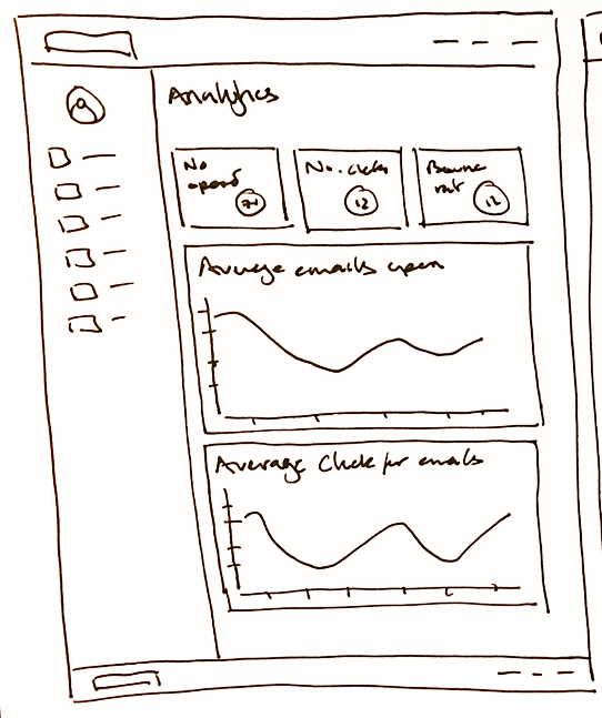
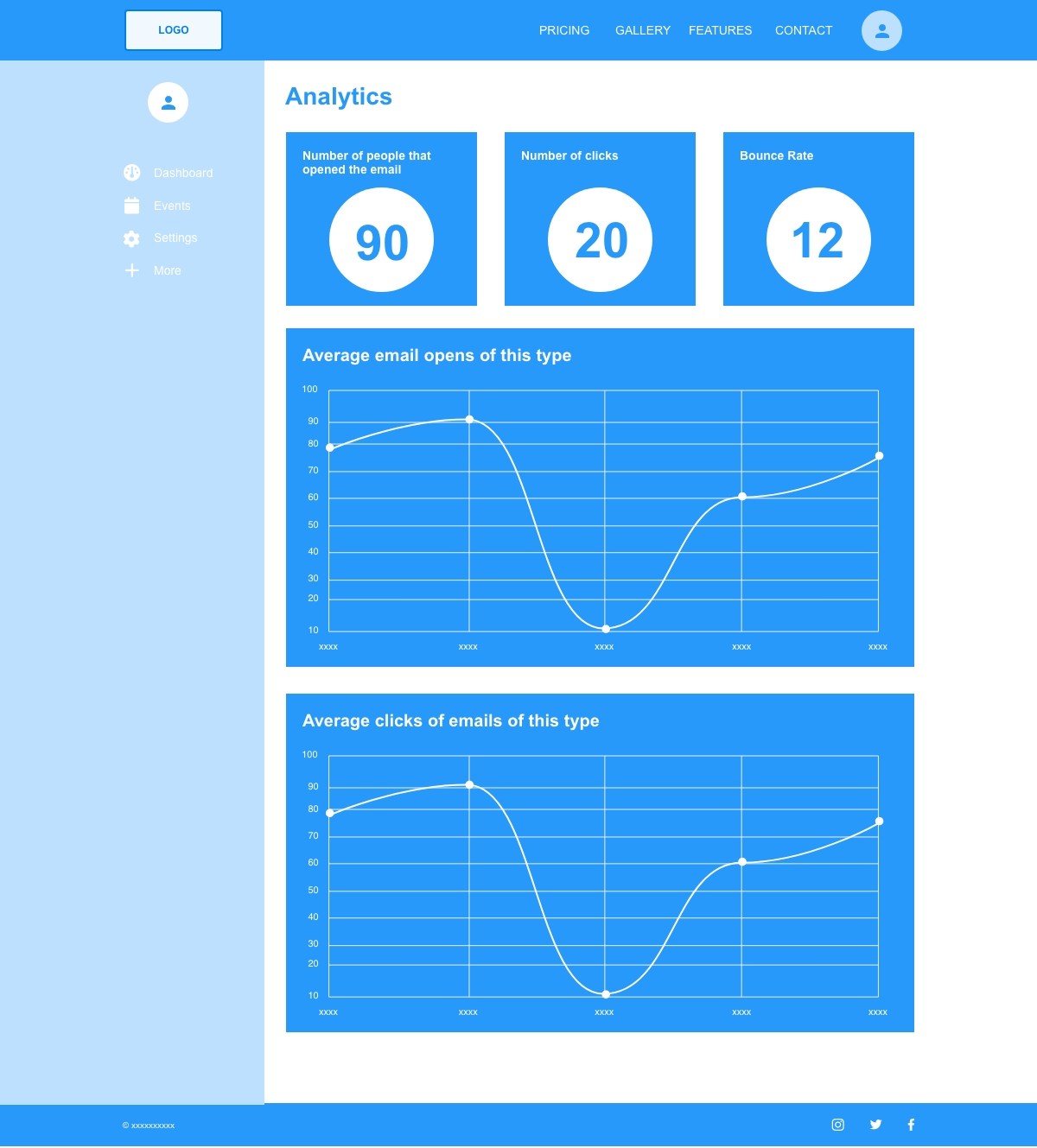
Ultimately the user wants to track the success of campaigns, through results. A way to monitor a campaign’s performance would be to give a clear idea of what works best for the business. This can be tracked by campaign reports and surveys.
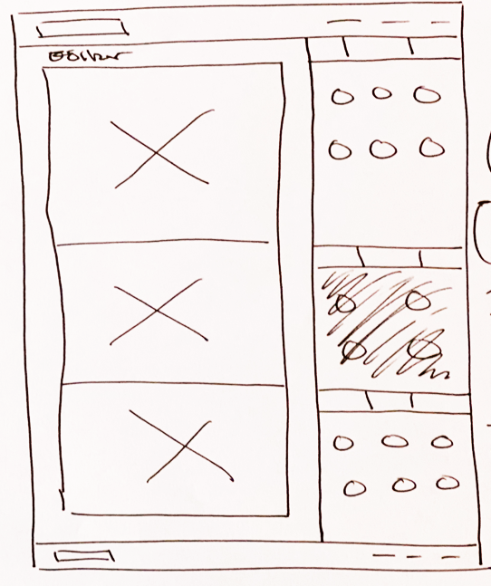
I think users - especially small business users, would like a degree of creative editability over their campaigns. Something that’s easy to use and requires nothing more than a simple drag and drop to compose. This would give them the confidence to get a campaign up and running in no time.
I’ve tried to be as clear and concise with my designs, to easily help both levels of users navigate to their required actions.
I tried not to steer too far away from the tried and tested route that the competitors have taken. I want the user to have a sense of firmiliarity in the features I’ve laid out. Although the features have firmiliarity, I still want it to be easily distinguisable between what features are accessible to different levels.
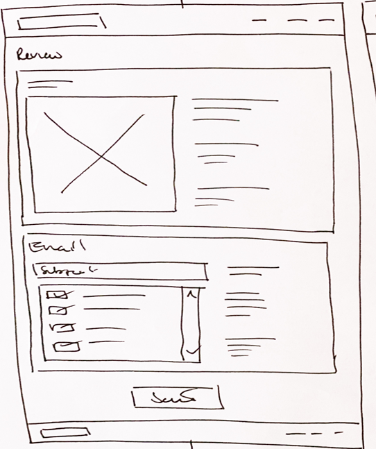
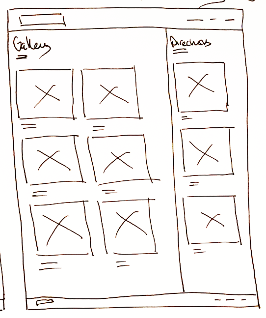
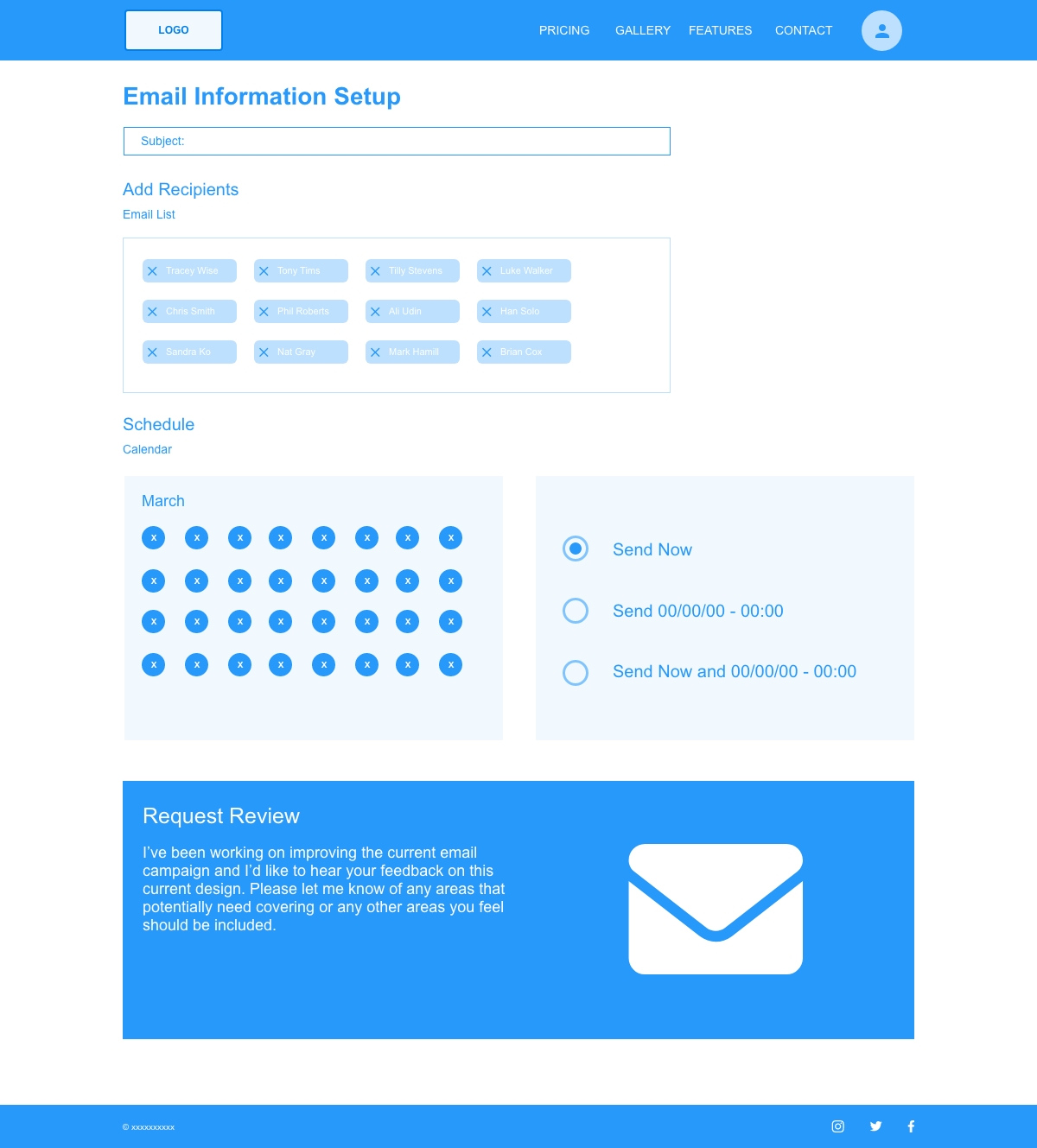
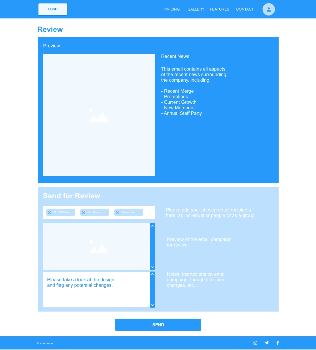
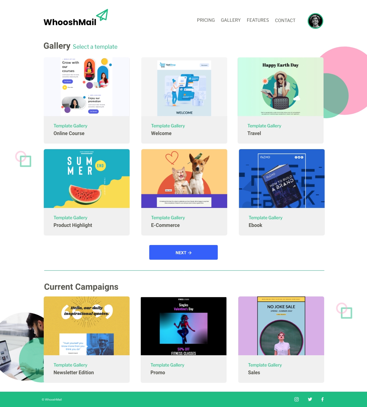
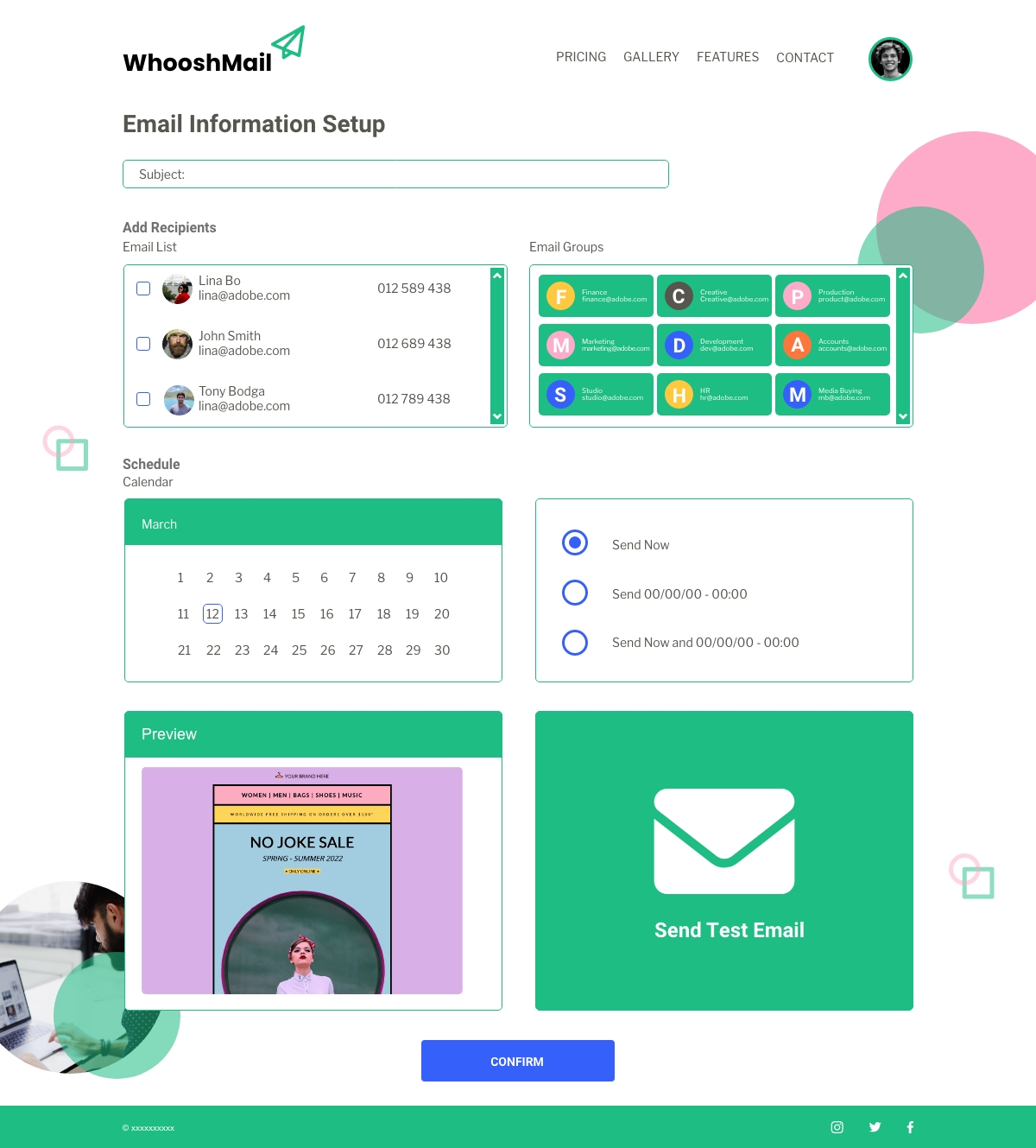
The gallery pages are very similar in design with only current campaigns and direction panels setting them apart. The template pages are the same, but a basic user only has limited options. Add receipts is again very similar in design, with admin having more options on who to send the campaign to, send test email and a preview panel. Send email pages are also very similar in design. Only the bottom panels differ in relation to the user access levels.
Admin Template Gallery Page
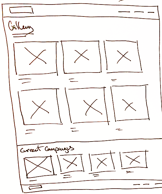
Admin Edit Email Template Page
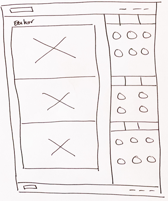
Admin Add Recipients Page
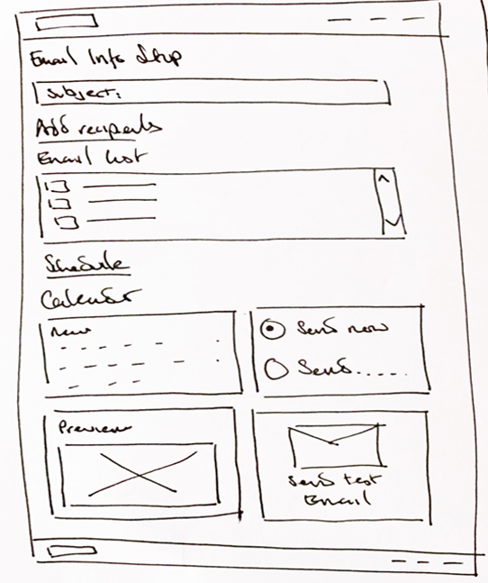
Admin Send Email Page
Admin Campaign Analytics Page
Basic Template Gallery Page
Basic Edit Email Template Page
Basic Add Recipients Page
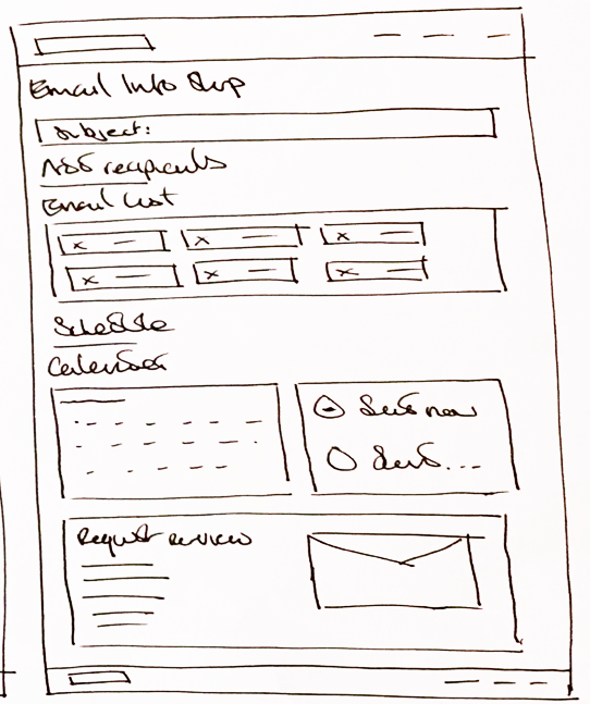
Basic Send Email Page
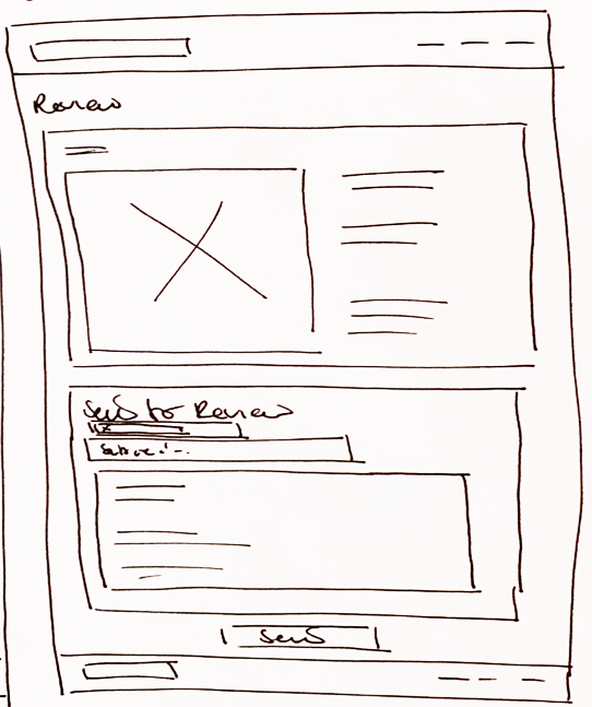
Basic Campaign Analytics Page

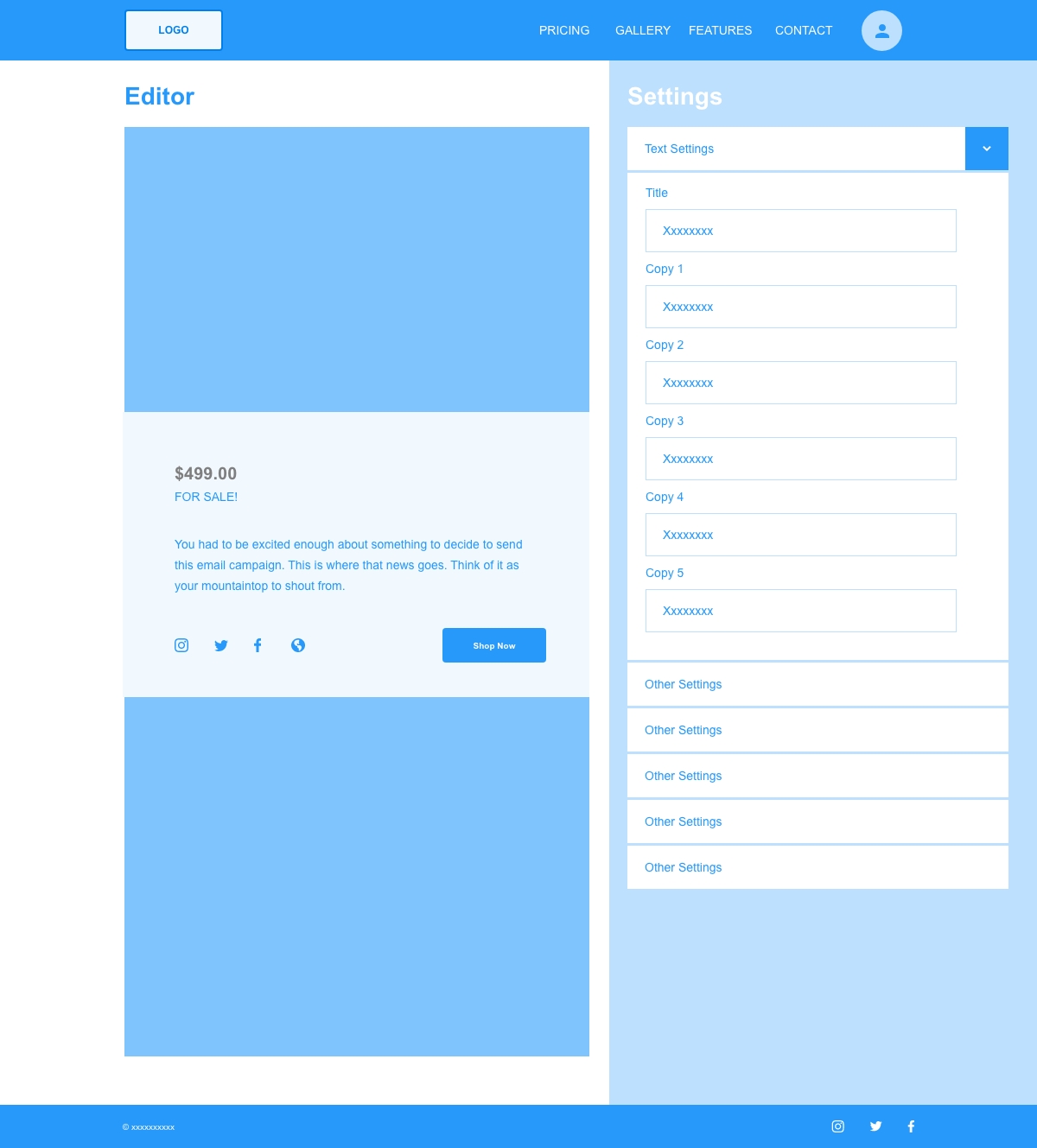
My ideas transitioned really well into creating the wireframes, I only made a few minor changes. Firstly I added an avatar in the header to distinguish the user. Then, the only other real change was laying out the settings panels in the admin email template page. I've incorporated more drop down boxes and added more design features.
Once the wireframes were complete I then created a prototype. I wanted to create a fimilartiy and cohesion to the user, so they didn't feel lost or confused when using the app. The video below walks you through the navigation to find the required pages needed.
Admin Email Template Gallery Page
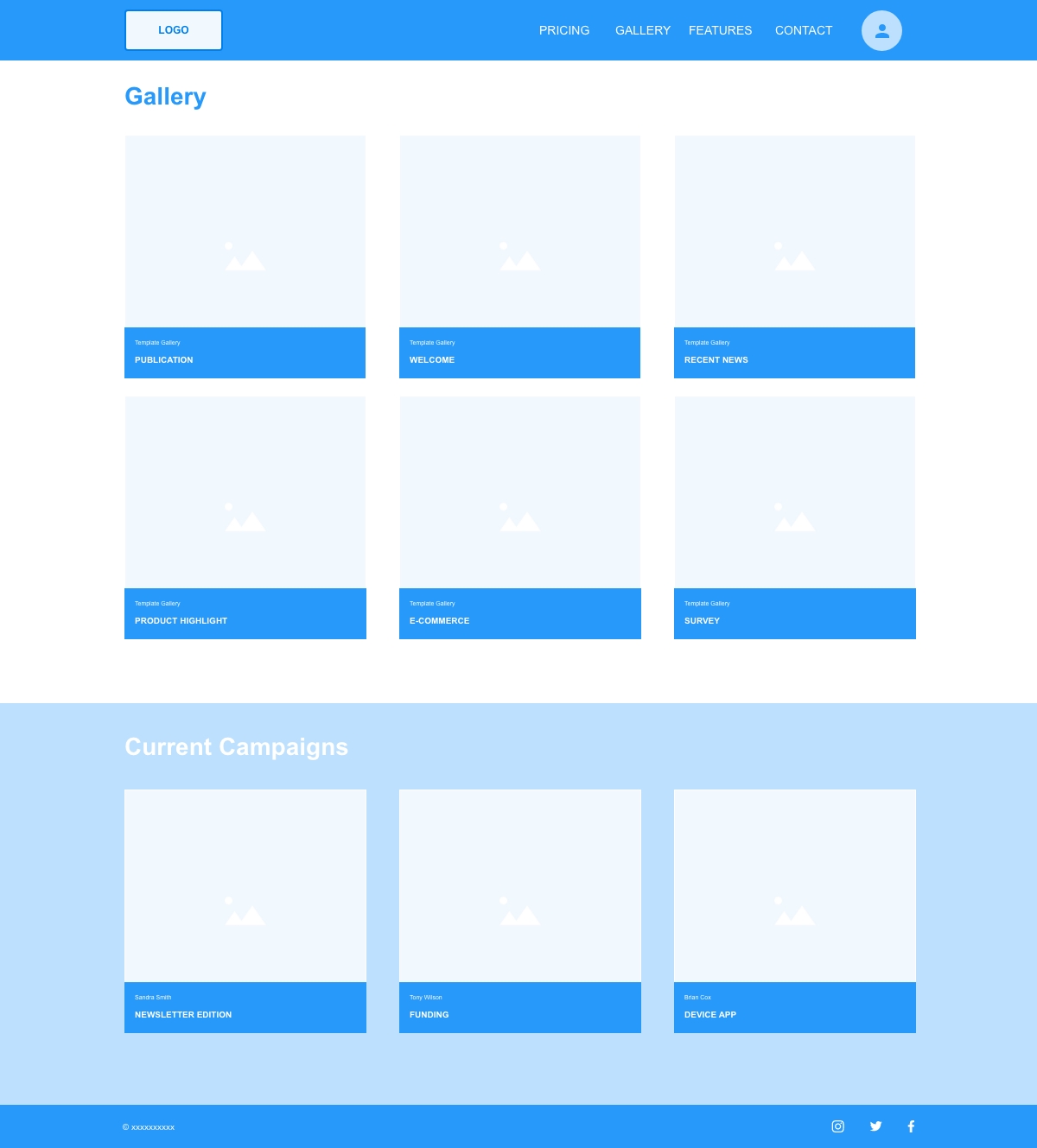
Admin Edit Email Template Page
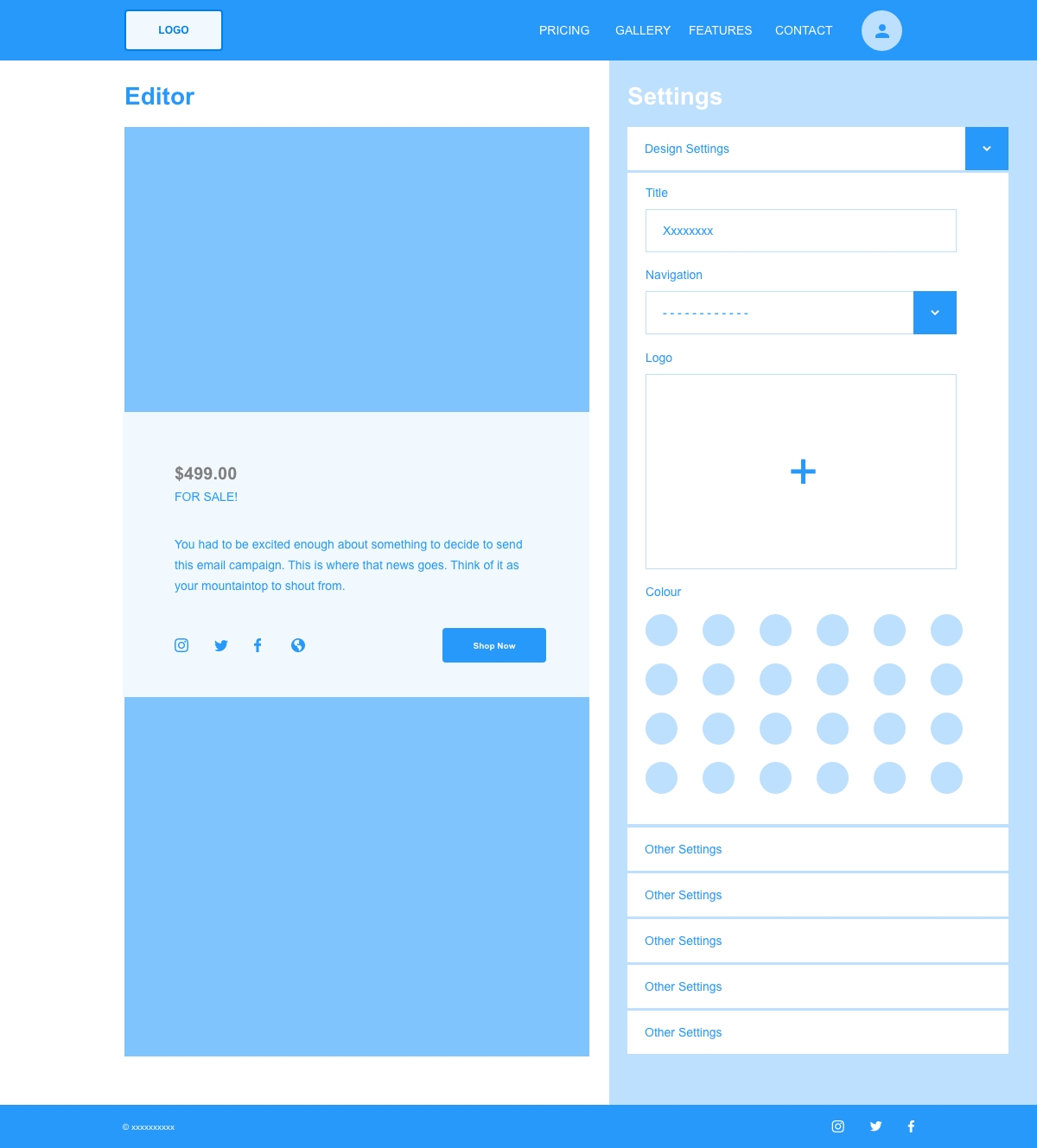
Admin Add Recipients Page
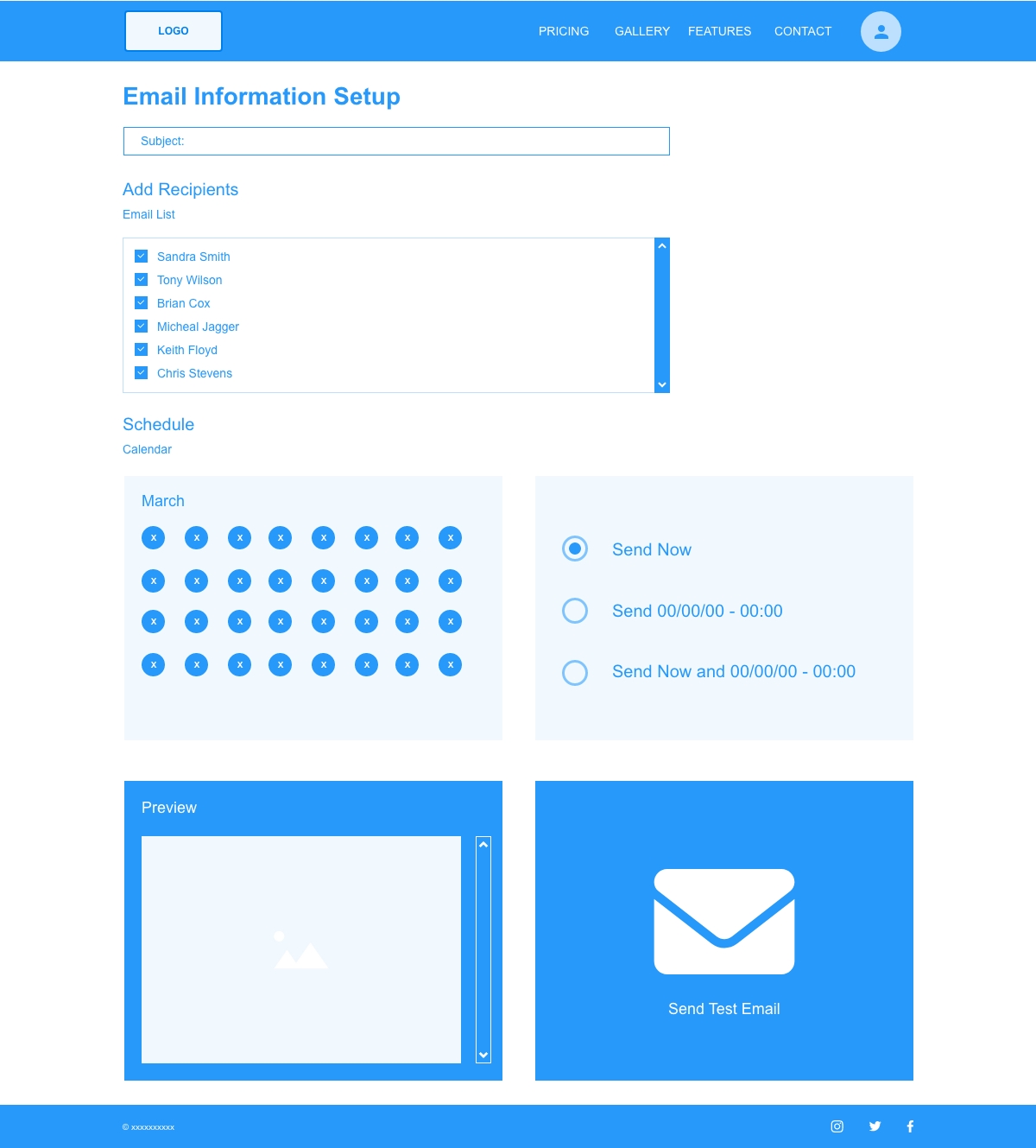
Admin Send Email Page
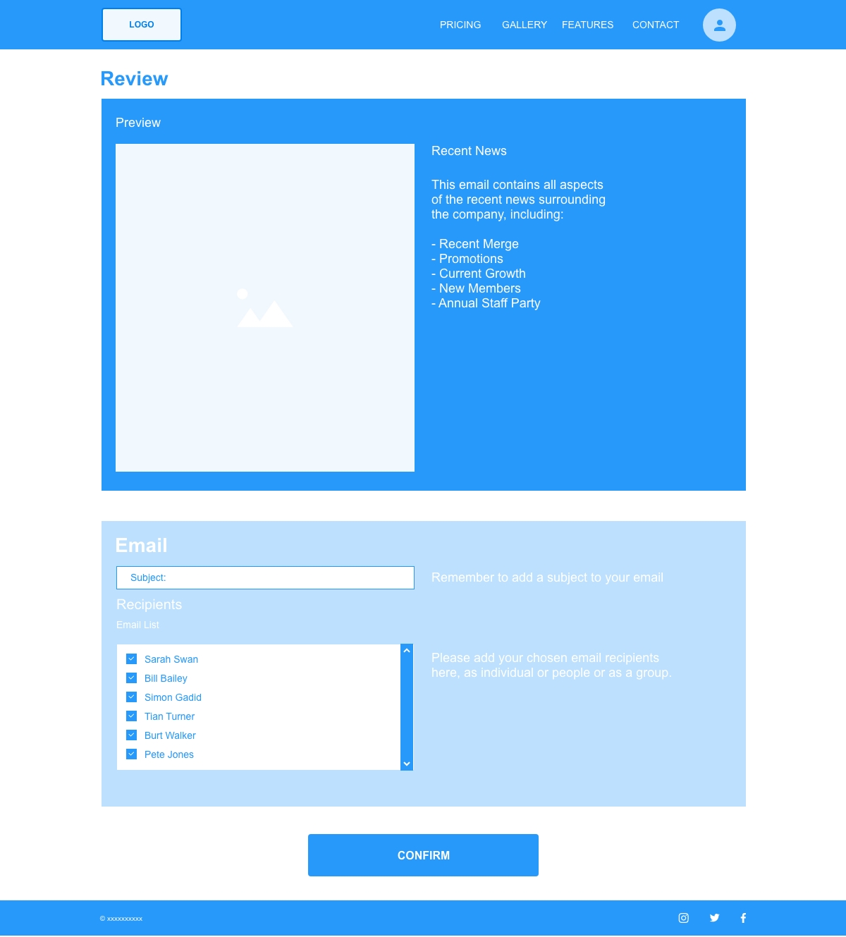
Admin Campaign Analytics Page
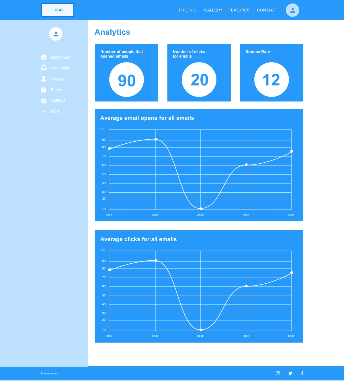
Basic Email Template Gallery Page
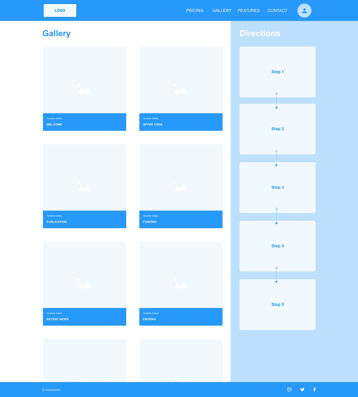
Basic Edit Email Template Page
Basic Add Recipients Page
Basic Send Email Page
Basic Campaign Analytics Page
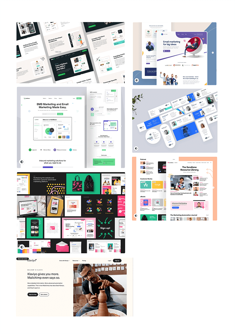
I initiated the redesign of the email marketing sites by firstly doing some research on similar sites. I collated screen shots of the sites into a moodboard to give me some scope and depth into visual key elements, such as colours, fonts, images and icons.
From the moodboard I was able to gauge a look and feel for the market demographic. The colours and fonts create a fun and vibrant feel, almost using a pastel feel with the colours that are not overbearing in contrast, but supplement the design layout.
I feel these colours and fonts don’t distract from the process at hand, but add a light heartedness to it.
I created the complimentary colours, using adobe colour. The primary colour is a shade of green, with a secondary blue colour that offsets the green nicely. This pulls the user to the CTAs to guide them through the process of using the site efficiently.
Although I created a palette of colours, I’ve tried to use these colours sparingly, only using a pink as an opacity in the background. I’ve also created a shade of grey for the text, as I felt black was quite heavy and could be overbearing.
I chose 2 fonts for the site - Roboto & Libre Franklin, I feel they work well in tandem. Using Roboto as a primary header and Libre for the main copy. They both have a young vibrant feel, complimenting the look and feel of the site.

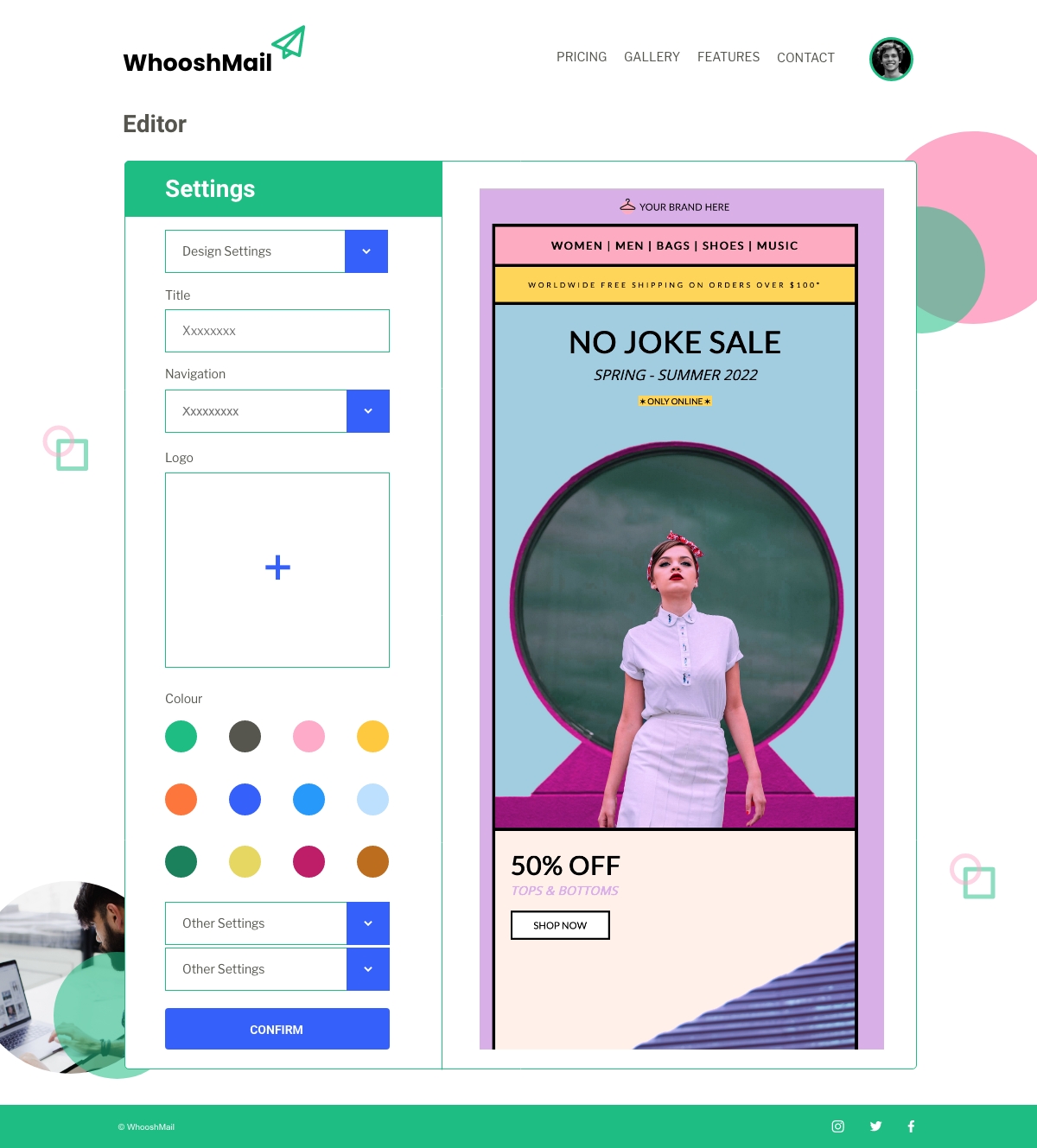
The initial layout change from the wireframes was to move the settings panel in both the admin and basic layouts. I’ve updated both of the layouts to incorporate the settings panel firstly, on the left of the screen. It makes more sense to have it as the first panel on the approach to using this page. It’s more intuitive to the user to expect this as the first step in this process.
I’ve also updated the layout of the basic email template gallery page. Again, to put myself in the user's shoes, I would expect instructions on how to use a process before I start any approach to it. By moving the directions panel first, this sets the user up nicely to their approach on their process of the site.
Admin Email Template Gallery Page
Admin Edit Email Template Page
Admin Add Recipients Page
Admin Send Email Page
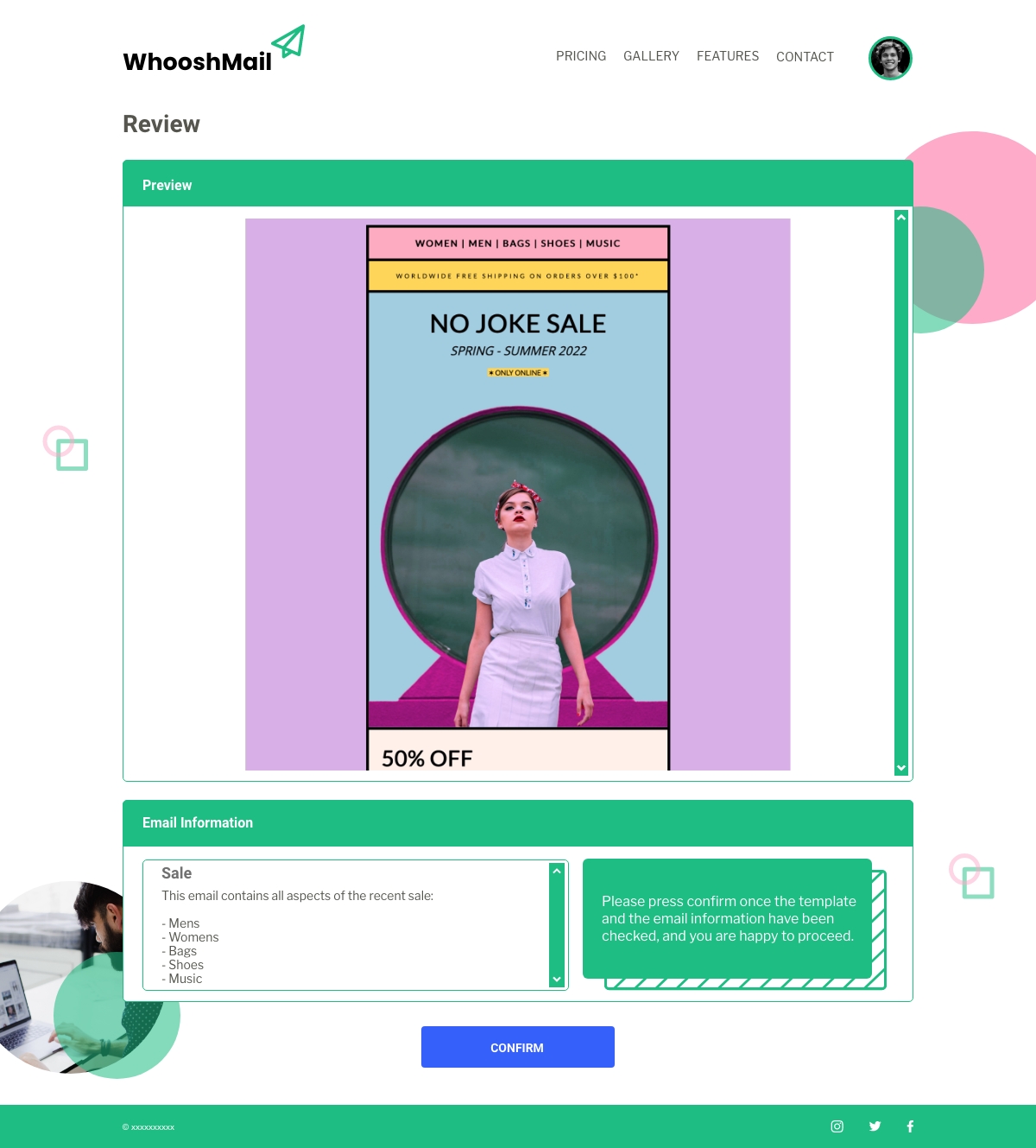
Admin Campaign Analytics Page
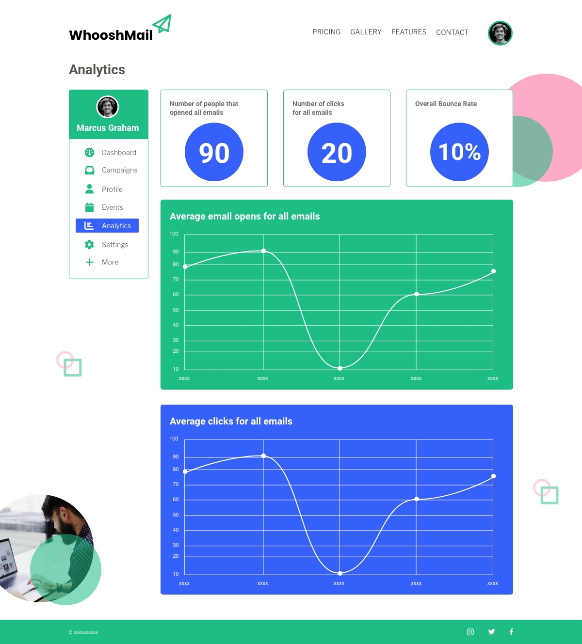
Basic Email Template Gallery Page
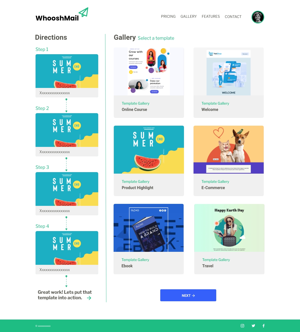
Basic Edit Email Template Page
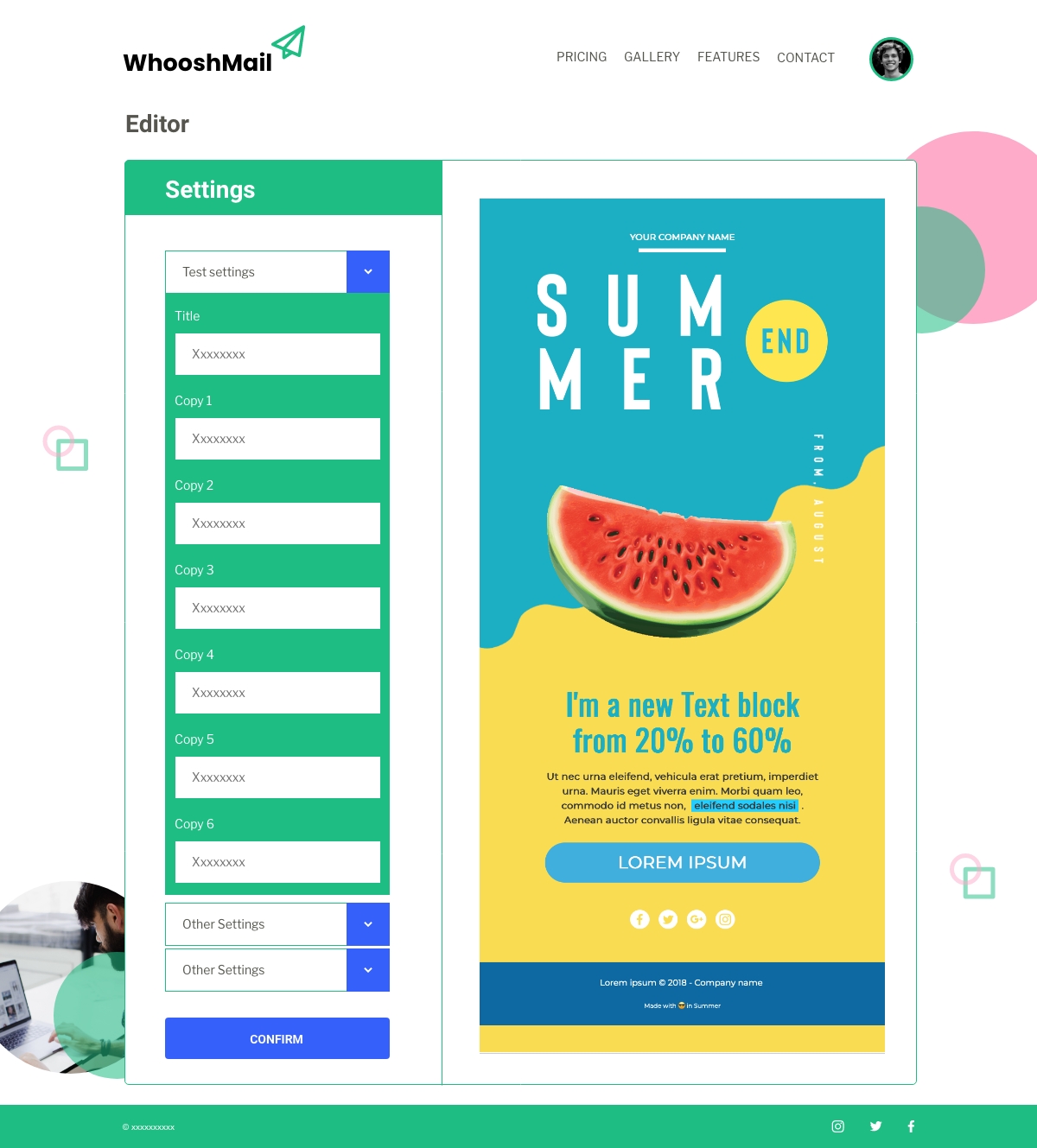
Basic Add Recipients Page
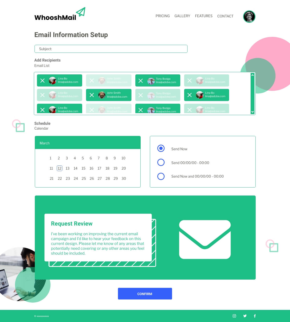
Basic Send Email Page
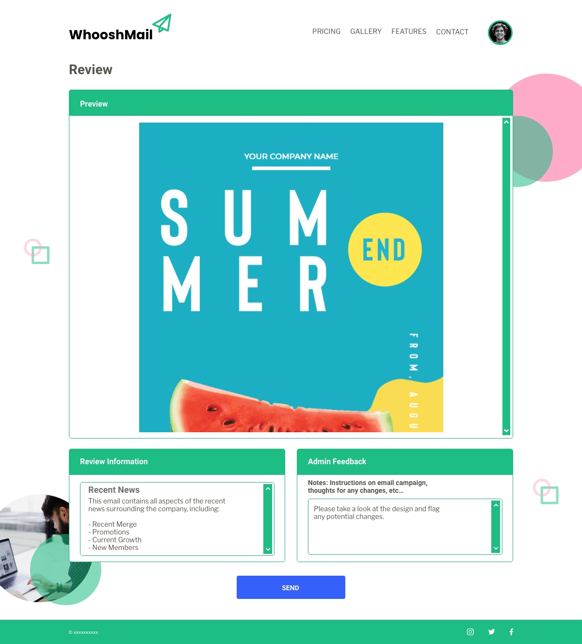
Basic Campaign Analytics Page
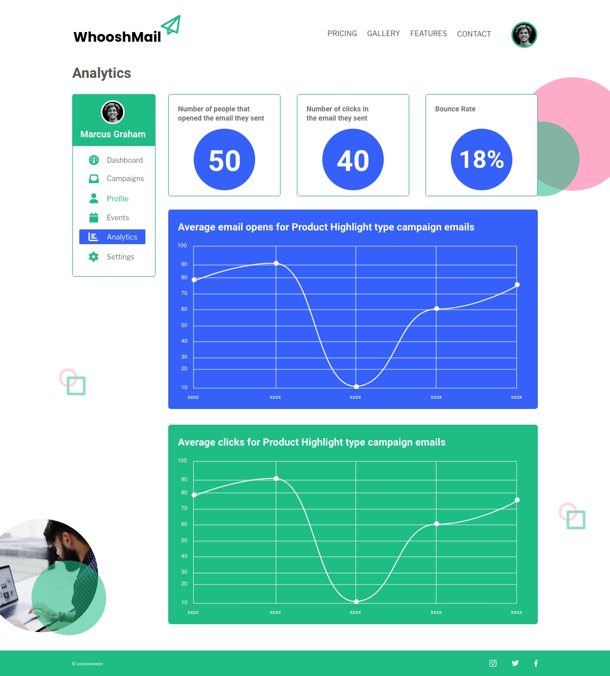
What I ‘ve learned from this project is how planning using personas, storyboards, through to competitor analysis, can really shape how you iterate your designs and the general scope of the entire project. You can really see how important these elements are to guide you, when creating a project such as this.
Another learning curve was conducting user testing, walking people through using my site. This reinforced my skills in this area. I can see how this can alter my initial designs and influence change to create a better user experience.
When updating the low-fidelity wireframes to high-fidelity wireframes, I got a better idea of the finished project, so some of the layout can change to reflect this. Some elements of the visual hierarchy can change as you introduce colours and fonts to the design.
Also, some elements of the layout changed once I considered the natural flow of a user experience. This is something to be more concise with, going forward.