I was tasked with a redesigning a website called shirtsbymike.com. It's an e-commerce website that sells t-shirts. The client wanted to know if anything should be changed to make the site look and/or function better for their customers. The simple hypothesis was - Treehouse students want t-shirts that are fun and make them feel connected to the community. Continuing to provide quality t-shirts to the Treehouse audience, in a more easy and engaging manner.
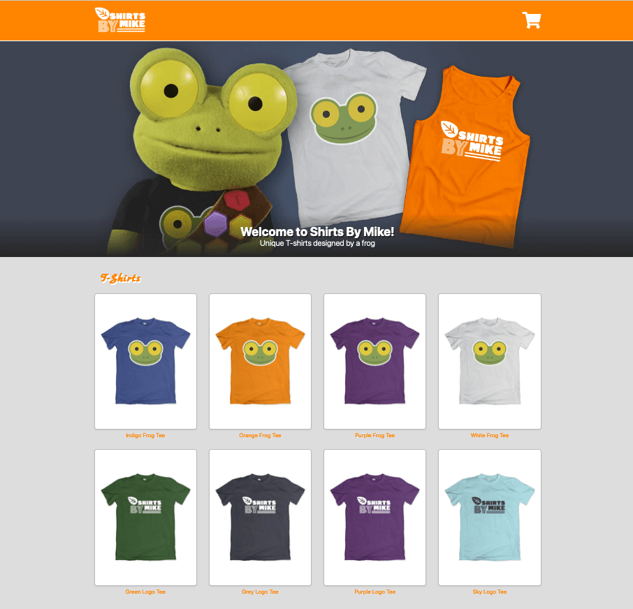
The current shirtsbymike.com, felt lackluster. It was dated and was in need of a refresh to the branding. It needed more of an identity and an easier user flow experience. One of the concerns of the client, was that the current site is unable to hightlight a featured t-shirt. The main concern was how to keep the potential user engaged enough to make a purchase on the site.
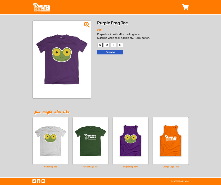
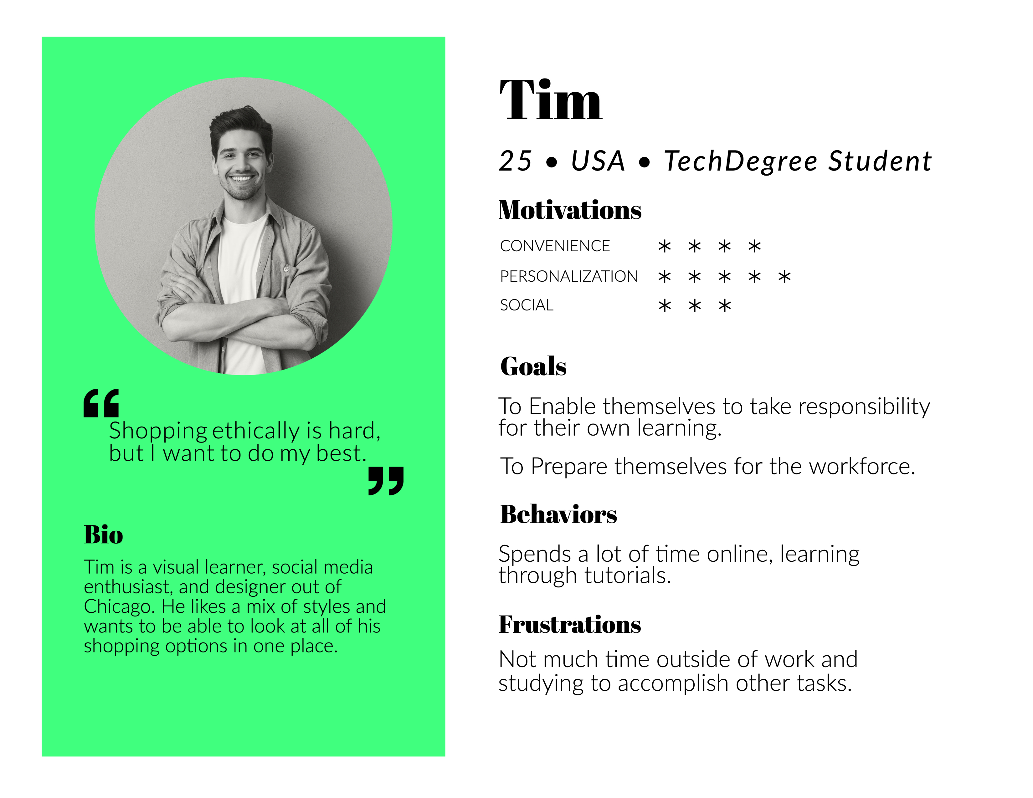
The target audience for Shirts By Mike, where: Mostly ages 16-35, primarily based in the United States, Treehouse students, lifelong learners, values community and is playful. I characterised the following user to represent a target user for shirtsbymike.com. His name is Tim, he's 25 and resides in the US.
He's a Treehouse Tech Degree student who earns $30,000 per year. His goal is to prepare himself for work, by taking responsibility for learning in his own time. He spends a lot of time online, learning tutorials. He feels that all the time learning leaves little time to accomplish other tasks.
1. Complementary colours, create a contrast that draw your eye in a step by step process - top to bottom.
2. The emphasis on different sizes, shapes and colours, make it easy to see the hierarchy in the information.
3. The whole composition of the site is well thought out and organised. This gives a sense of trust in the user.
1. There could be more content on the information behind the business, to give a clear understanding of what this website is.
2. The site could include a navigation to help you move around easily.
3. The shopping area could be structured to incorporate groups for different items and genders.
designbyhumans.com
Well organised and structured elements on the page, with emphasis on high contrast imagery which creates a trustworthy and engaging user experience.
There is a lot of content on the site, this could potentially overwhelm the user.
I would like to incorporate a search function from this site, into the redesign.
threadless.com
Visually engaging with the use of complimentary colours on high contrast imagery with a nice use of repeating patterns.
The site could include more content behind the business to inform the user of its main objective.
teepublic.com
The emphasis on high contrast images with complimentary colours and shapes in a grid, creates a strong visual engagement with the user.
I think the leading hero image could incorporate more context about the sites main intention.
Is the site successful in what it is trying to do? The site is very visually engaging, with its use of colour, imagery, organisation and hierarchy. What suggestions would you give to improve the site? I would like to see the t-shirts and tanktops in groups (gender & styles). I think a search function would be beneficial. The option to create an account for user.
Adding groups would give a cleaner, less cluted landing page and direct the user to their preference more efficiently. A search function could save time when scrolling through a site, when looking for a particular piece.
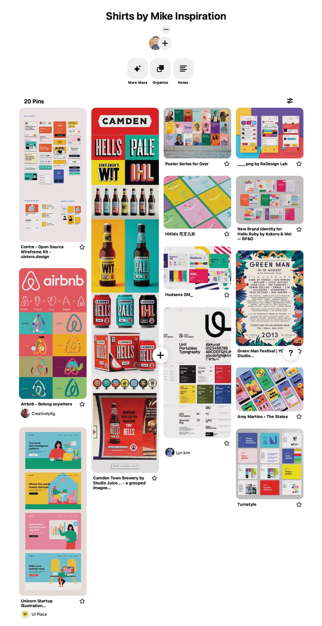
A site, that straight away captures their interest with youthful style, design and content. This incorporates a layout, with high contrast colorful imagery and colours that are bold and that compliment. Also, a site that’s easy to navigate, that’s structured well with uniformity, a site that can guide their behaviour. A site with fimilar persuasive patterns, e.g. sequencing patterns in purchasing a product...step by step process of purchase.
This would add a sense of comfort and familiarity. It would guide them in a behavioral pattern that they are used too. This would also cut down on time searching for a product. Also, less items on individual product pages. I think pagination would de-clutter the page. The familiarity of pagination (as used on similar sites they use), makes it easy to scroll through all the items. I also think they would be interested in an option to create an account. This Would make purchases quicker and easier in future.
The catalog page. I think they would like to see a page structured into categories for genders or particular groups, so they can easily navigate to what they want. I also think the user would like to see more links to associated social media sites. I think this could reinforce their purchase decision by engaging with like minded customers.
Homepage
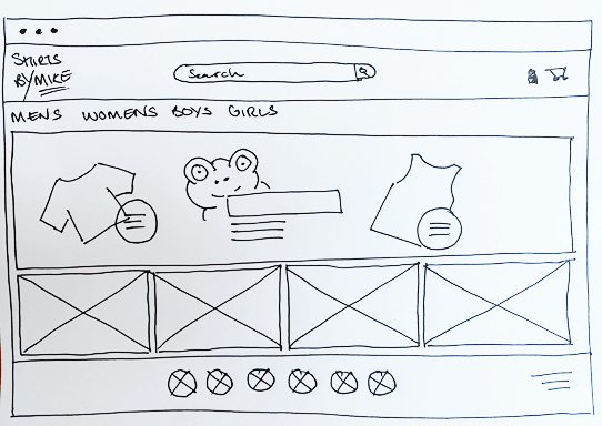
Catalog page
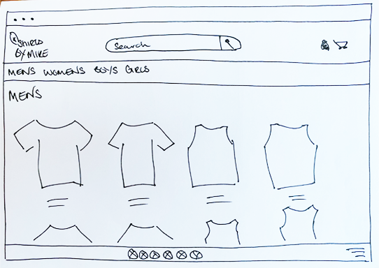
Individual product details page
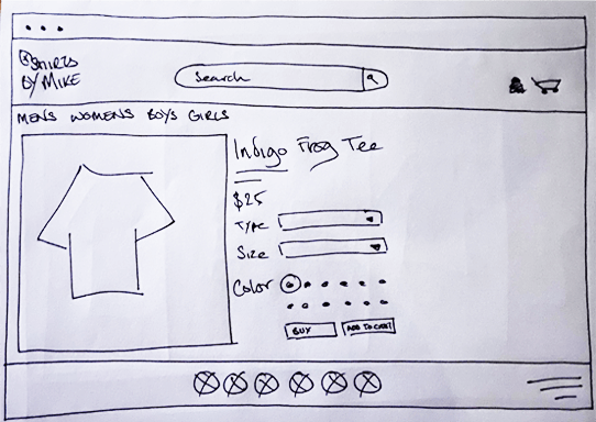
Contact page
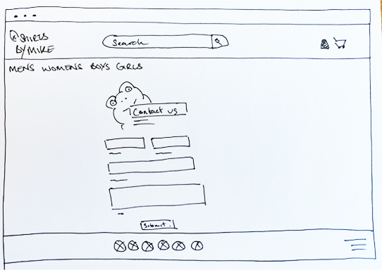
Homepage
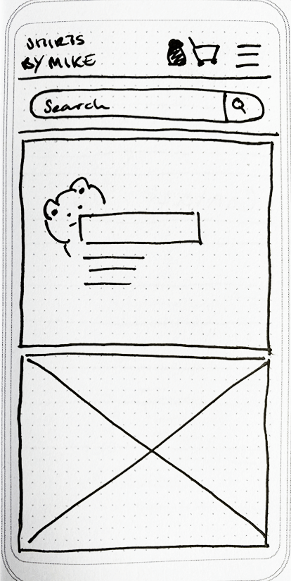
Homepage Open
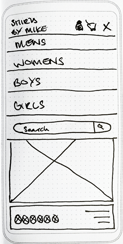
Catalog page
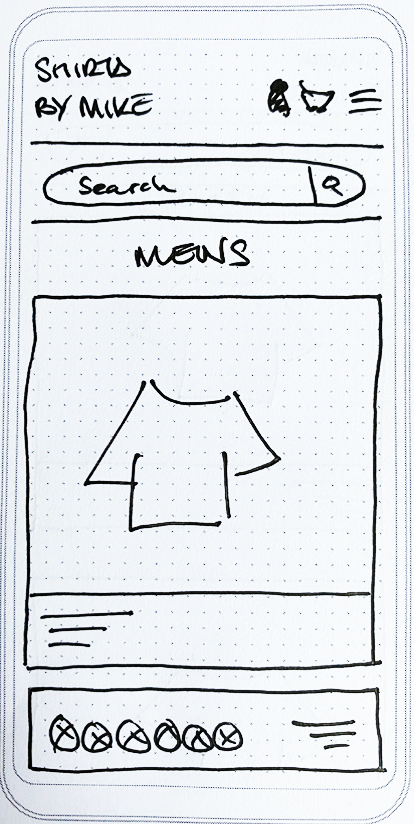
Individual product details page
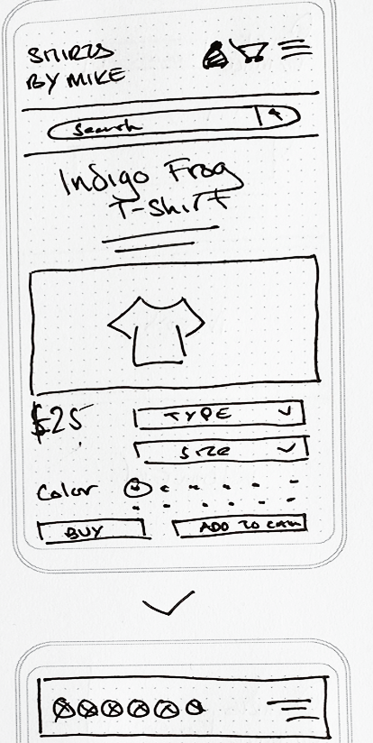
Contact page
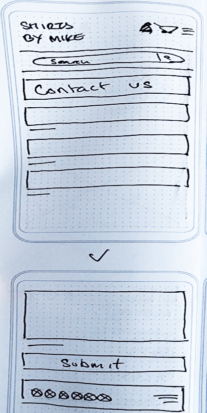
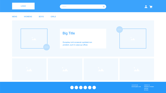
I feel my sketches transitioned well to wireframing, keeping all the fundamentals of each version of the site as is. There’s only a few minor tweaks to a few pages.
I set the desktop size of the screens to 1920 x 1080 px, using a 12 column grid. This helped in structuring elements on the page.
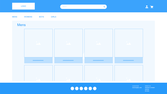
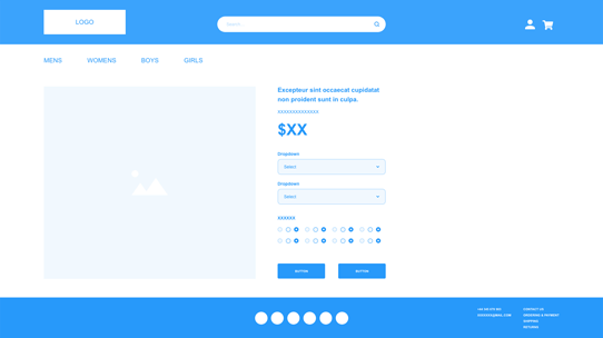
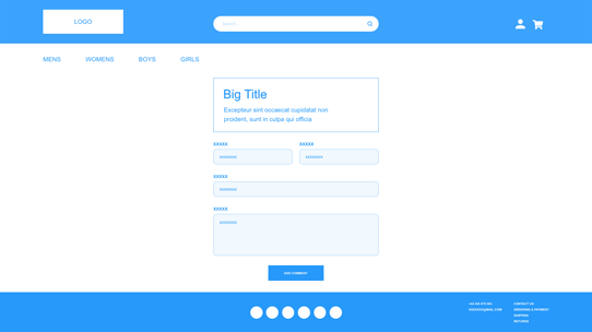
The Homepages stay as is from the sketches. For the catalog page I decided to use cards with descriptions to give the page more structure and uniformity. For the final 2 pages, everything translates as is from the sketches.
Homepage
Catalog page
Individual product details page
Contact page
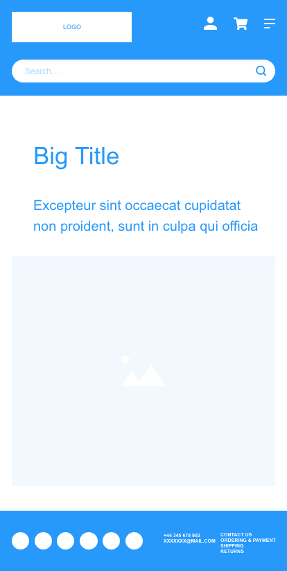
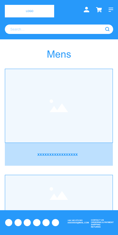
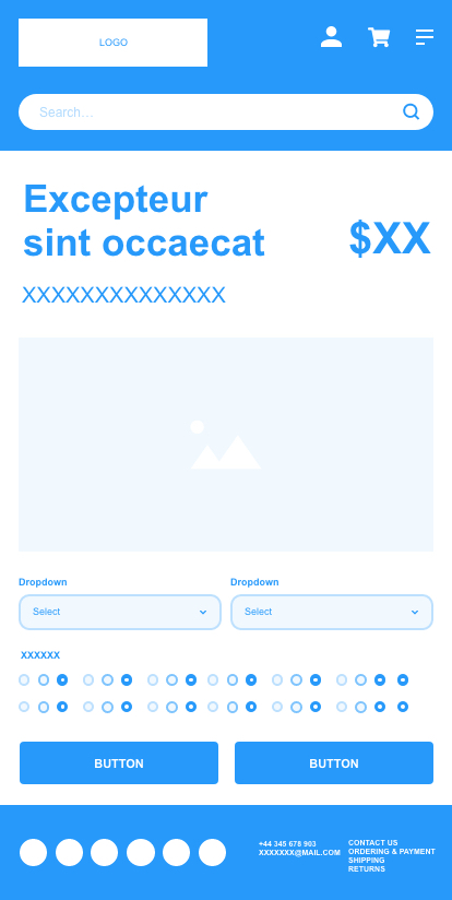
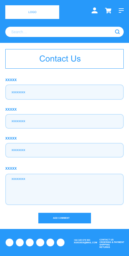
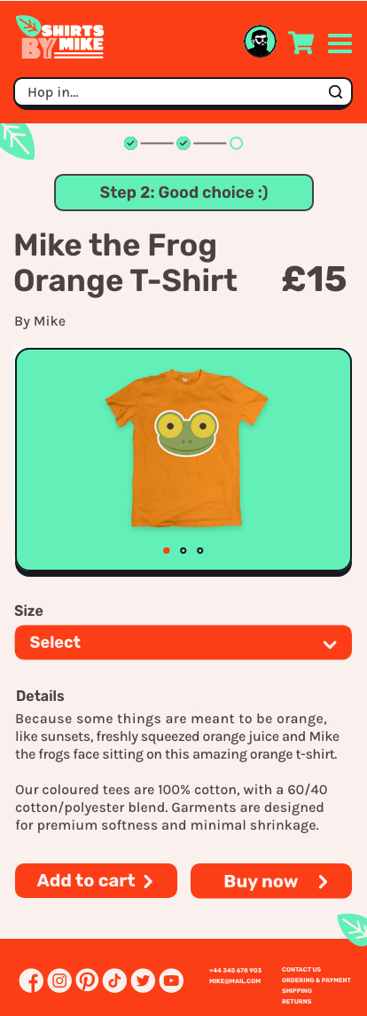
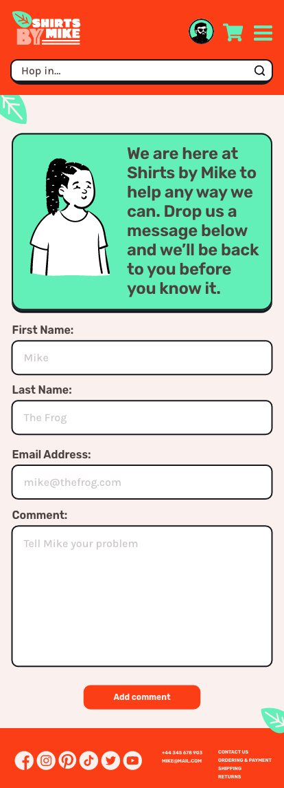
The biggest consideration I had to make when optimizing these designs for mobile, was to make all the components legible for the user to view and to use. Also, when downsizing the design from a desktop size viewport, I had to consider the space and how best to use it.
For the main structure of both designs, I’ve condensed a 12 column layout into a single column layout.
The navigation is now responsive, so when the site is at a mobile min width size, the navigation is hidden in a burger nav. The navigation drops down when engaged by the user
The header of the design incorporates the logo, user icon, shopping cart and burger nav, inline. Then there’s space for the search function below.
The layout for the rest of the pages are restructured to fit into a single column layout. This will give maximum visibility and usability. The only drawback is there’s more scrolling or sliding for the user.
Homepage
Catalog page
Individual product details page
Contact page
My first approach to this redesign was to first take a step back and look at both the challenges for the user and the business goal of the site.
With this taken into consideration, I wanted to deliver a final product that’s efficient, fluid and easy to understand but not strictly pragmatic. I Then also wanted to take into consideration the emotional value, which is what makes the overall experience enjoyable.
I wanted the redesign to be tangible by making the navigation experience as intuitive as possible, by way of a functional design.
I needed to define the purpose of the redesign. This incorporated referring to the problem, goals and the big picture - it has to be easy for the user. How does this affect them, what behaviour do we expect to see from our users and does my design encourage that.
I wanted to create emphasis in my design that captures the users focal point.
I feel my redesign captures this by creating dominance and subordination. The dominance in the design guides the user into what I want them to accomplish easily, whilst the subordinate side nudges them towards the dominant elements.
I feel my redesign creates focal points incorporating the 3 main components of, proportion (scale - that demands attention, contrast - colour, shape and size and the physical relationship of elements in relation to each other.
I also feel my redesign incorporates isolation and proximity of objects to give them more emphasis. It also has a continuance that guides the user around the site in the direction I want to take them.
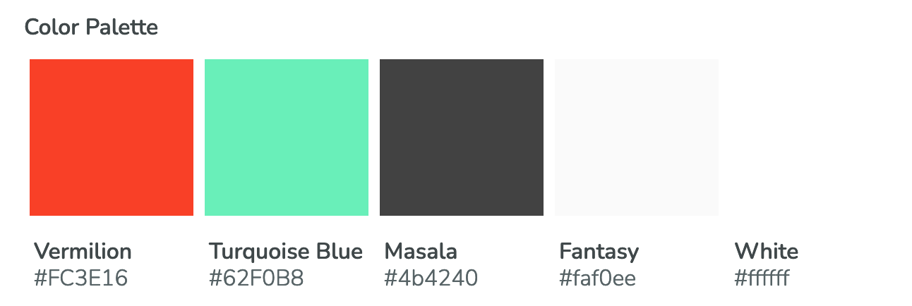
I wanted to stick to an orange colour as the primary colour, so I chose a different, bolder, brighter shade (vermilion), to create more contrast. Orange is very vibrant and energetic, so I feel this has a good association with the demographic of the user.
For the secondary colour I choose turquoise blue. This offsets the orange with a cool tone that compliments the orange's strong vibrancy. I feel it works well as a subordinate colour to emphasise the boldness of the orange.
I then added 2 grey colours to the project, one for text and one for a subtle differentiation against the white background.
I used the Erica Schoonmakers technique to harmonise the greys with the base colour. I did this by overlaying the greys with vermilion (orange), then dropping the opacity to 5%. Its a small detail, but it makes a big difference to harmonise the greys to colour scheme.
The body typeface is considered to be the most important choice for any site. So with this in mind, I wanted to choose a typeface that speaks the language of the target user and that represents the style expected by the user, so my choice was Karla.
I chose Rubik as my display typeface, as it encompasses all the considerations of Karla and works well in tandem to represent the emotional attributes of the brand and the user.
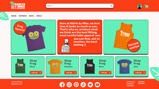
Homepage
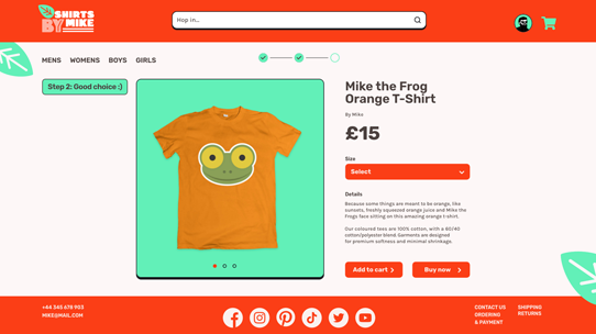
Catalog page

Individual product details page
Contact page
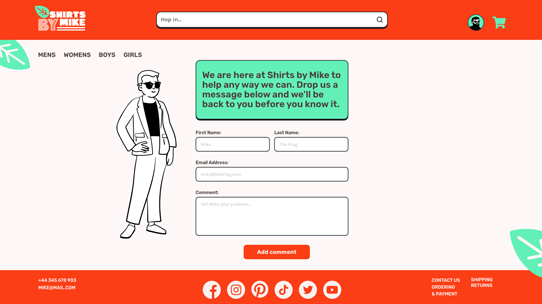
Homepage
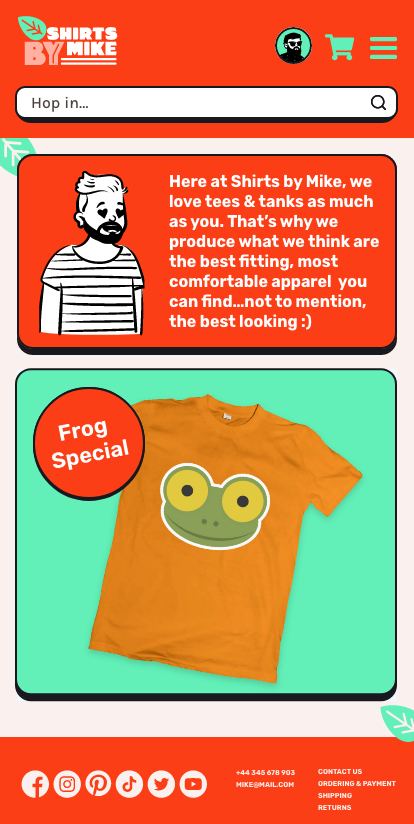
Homepage menu down
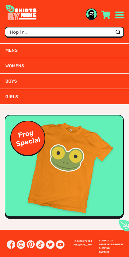
Individual product page
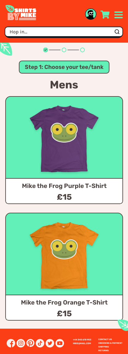
Individual product details page
Contact page
The things I’ve learned most from this project are; use of colour, font pairings and writing UX content.
Colour - I really found this aspect of the project enjoyable. It involved a lot of trial and error, but I was really pleased with my final colour palette selection. I was especially pleased to learn the Erica Schoomaker technique, to harmonize grays. The gray tones I created offset well against the primary and secondary colours.
Fonts - Finding a good font pair required a lot of research, not only for a pair that worked well together, but for a pair that represents the style expected by the user. I’m really pleased with my selection of Rubik for display and Karla for the body. They work well in tandem and represent the emotional attributes of the brand.
UX Content - This personally was the biggest learning curve for me and involved the most amount of time and research. I did really enjoy creating a brand persona, I really hope this conveys itself in my work. I hope it adds to the user experience, making them feel good and wanting to come back time after time.