The second case study was to research, prototype and user test a grocery app. Initial research was to identify the target audience and to understand their pain points, wants and needs. I then needed to recruit the right people to fit this criteria to test the app on.
The feedback I gained from the user testing then allowed me to implement some ideas for the app as sketches then wireframes. Once I laid down the wireframes, I could then bring the ideas to life by adding interactivity in the form of prototypes. I was then able to test my prototypes on users to gain important feedback on my desgins. Gaining insight and feedback from users proved to be invaluable insight to how your designs are implemented in a real life scenario.
A new client is creating a grocery store app for the local grocery store. They want me to conduct initial research to help determine specific problems or pain points, users might have whilst shopping. They want see if a grocery app can elevate some of these problems.
I need to create a user research plan to organise and layout my initial interview questions.
The client then reads through my research notes and is ready to move forward with creating an interactive prototype focusing on the main pain points I found during my research phase. They want to see how the app would function to solve these particular pain points. I then sketch my design ideas, then create medium-fidelity wireframes linked together to create an interactive prototype.
The client then reviews my prototype. They would like me to complete usability tests with participants to confirm the functionality of the app. And that it makes sense and that users will be able to accomplish a task necessary to solve their pain points.
The target audience for the grocery app, will be a group of people I perceive to be the main users of the product. A few characteristics I’m looking for in the users (why they are a target) are: That they are busy working all the time and they shop with children that don’t always behave well in the shop. The participant criteria I’m looking for, includes:

The feedback from the user testing highlighted a number of challenges when shopping. I complied all the feedback to find the most common repeating pain points.
The key pain points from my interviews where: freshness of items, time spent in supermarkets, personal space and spending on impulse.
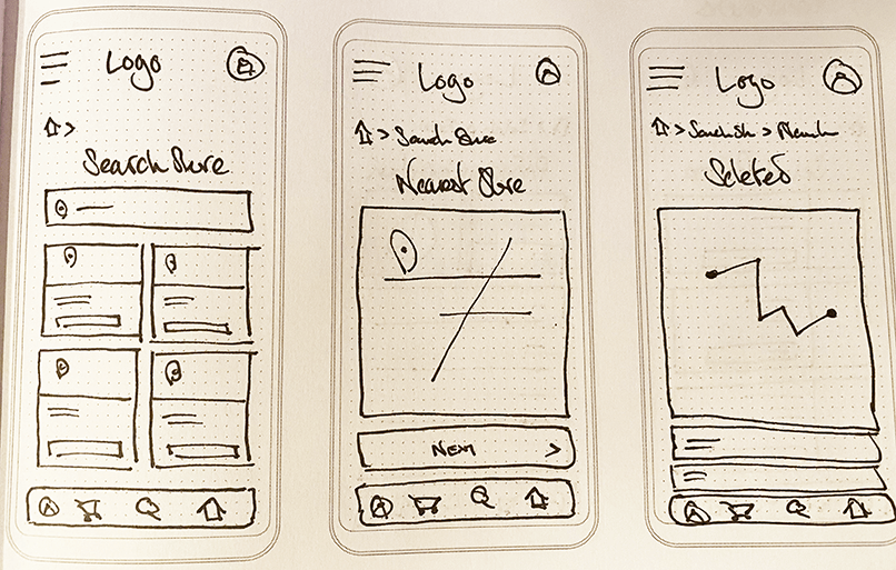
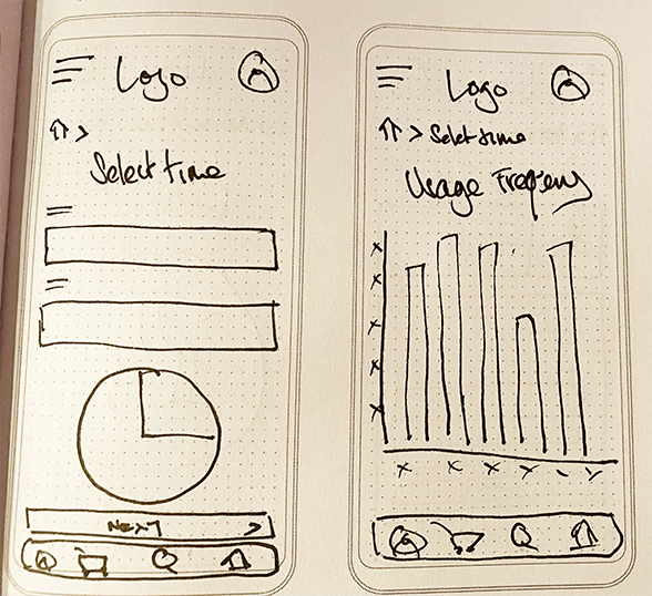
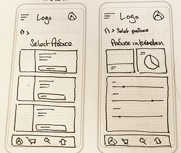
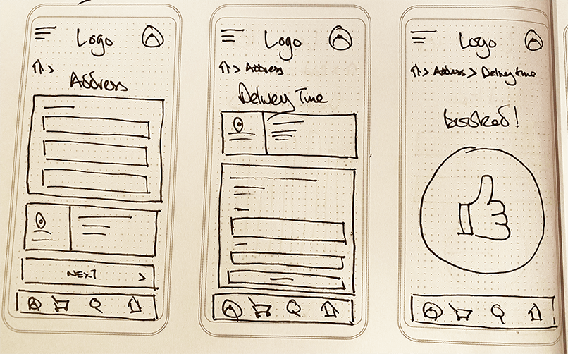
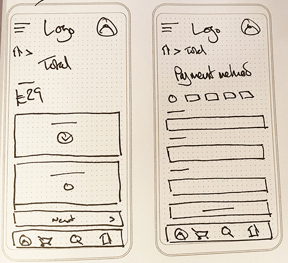
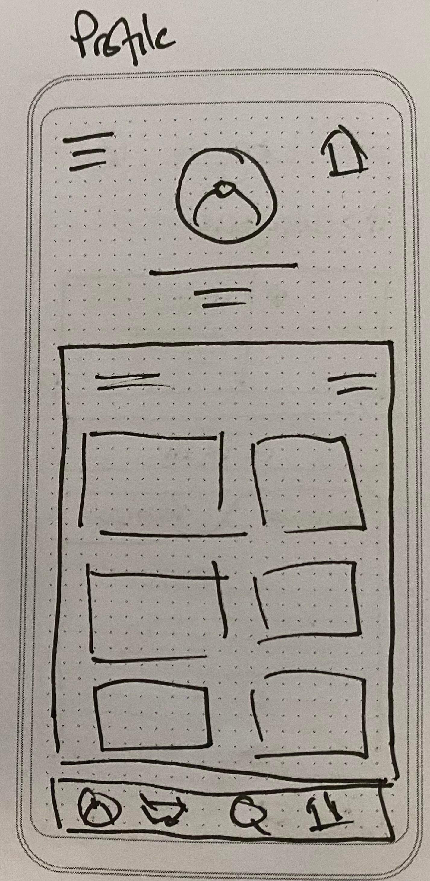
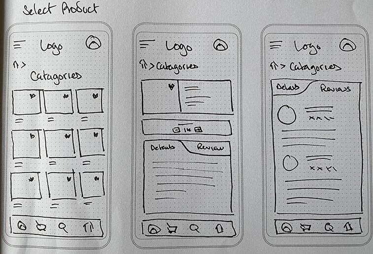
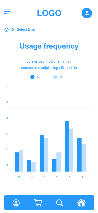
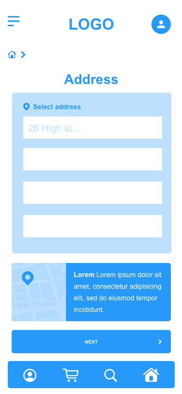
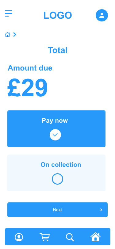
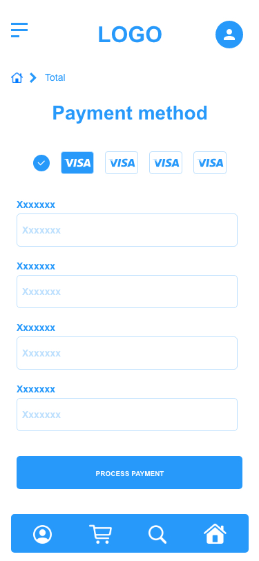
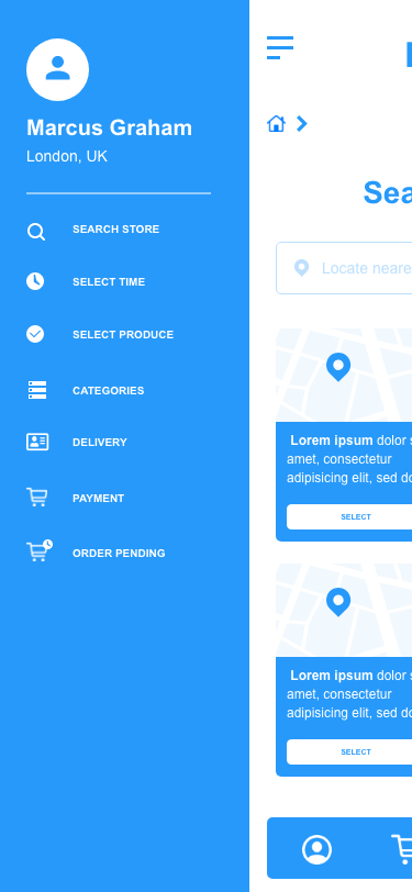
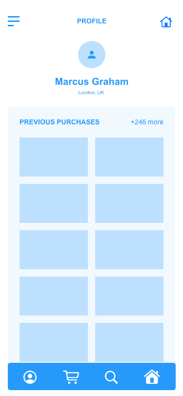
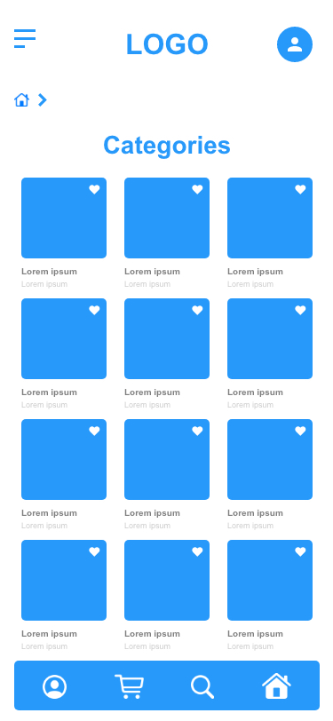
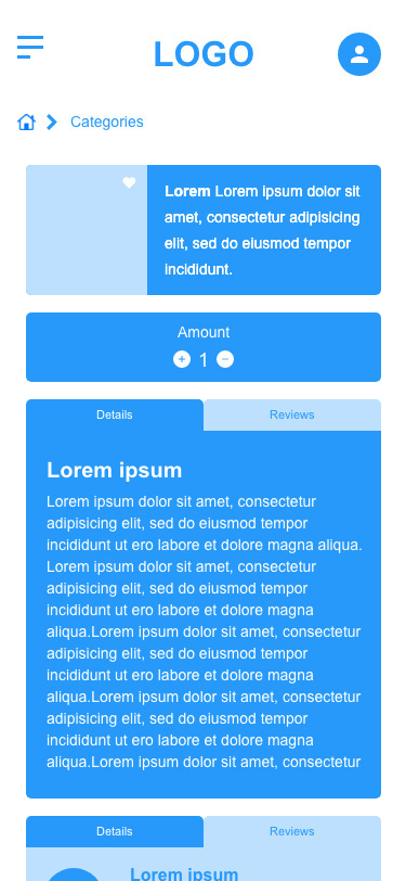
I wanted to eleveate these main points and therefore based my designs accordingly. I created sketches and then wireframes to help users find a convenient shopping location, find a quiet time to shop, find the freshness of produce, delivery slots, user profile, product selection and to see their order pending.
Once the wireframes were created, I put them together as a prototype for the users to test. This would unltimately be the barometer as to whether their pain points were resolved.
I wanted each step in the process to give the maximum amount of information without being too overwhelming for the user. I tried to cut down each process to a minimum to keep the user engaged.
The main point of learning that I took away from this project was thoroughly thinking through the steps for each process.
I wanted the user to easily access other parts of the app by giving them multiple areas to click on to, to navigate to the most popular parts of the site.
Setting up the navigation was another big consideration in the process of a full build for this app. I used breadcrumbs throughout my processes. I feel going forward for a full build of the app, this would help users navigate the site hierarchy, which could potentially have many levels. Breadcrumbs are also very supportive for users who enter the app/site in a deeper level from an external source, such as a search engine.
Location
Time
Freshness
Delivery
Pay
Menu

Profile
Select Product
Order Pending
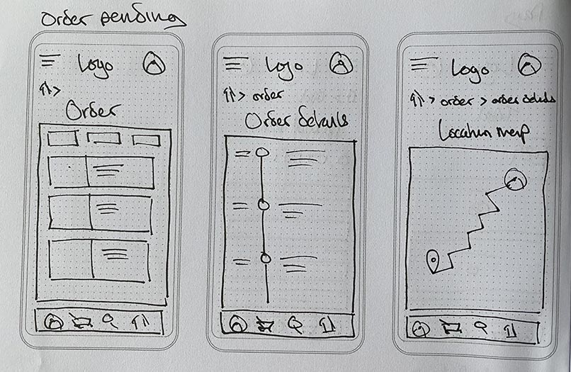
The wireframes translated well from the intial sketches. I feel they convey a good deal of information to keep the user engaged but not overwhelmed with content. I find the layout adds reassurance to the user as it has a familiarity, easing any stress when engaging with the content.
Once the wireframes were complete I then created a prototype. I wanted to create a fimilartiy and cohesion to the user, so they didn't feel lost or confused when using the app. The video below walks you through navigating the app to find the required page needed.
Location
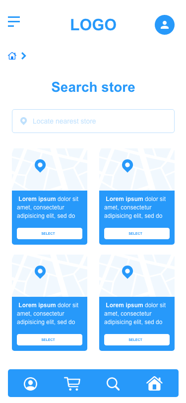
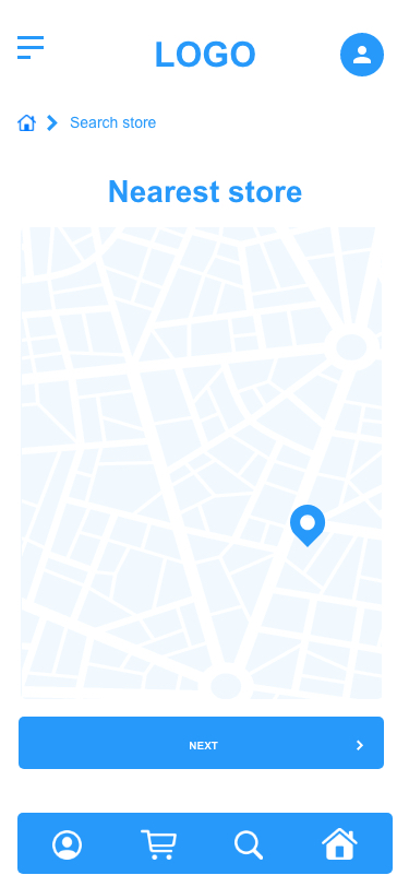
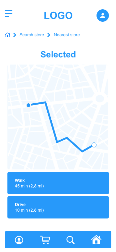
Time
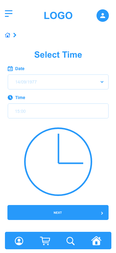
Delivery


Pay
Menu
Profile
Select Product
Order Pending
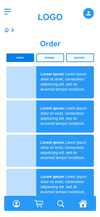
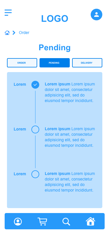
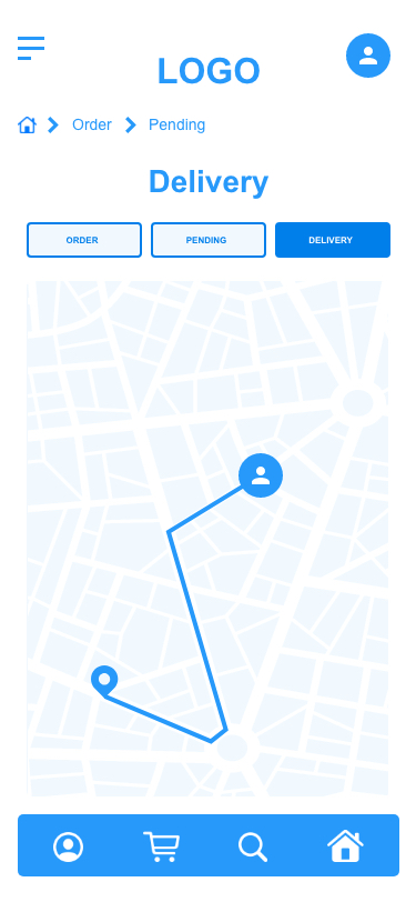
The majority of the users found the app clear and easy to navigate. None of the participants struggled to find their way through the app and quickly got to the desired pages.
A few of the participants found the layout and function of the app to be intuitive, making the processes seem second nature. Some said that there was a familiar feel to the app, easing through pages was easy to do.
The only real frustration from one of the participants was the confusion with profile and homepage. This is something to potentially look at going forward - creating a clear distinction between the two.
Going forward some of the participants would like to see less steps (pages) when trying to complete a task. I could look at combining some of the pages to create quicker processes in some areas.
Ideas for some changes form the participants included; grocery offers, a shopper rewards page, a recipe page, build a meal page and lastly a search bar at the top level to quickly access what they are looking for.
Lastly, I feel the app could amalgamate some areas to reduce time and effort spent by users completing tasks. Select Produce and Categories, could potentially combine to save user time and effort.